Rolling-window analysis: how to read worst-case returns
Rolling-window analysis takes a fixed-length period (for example 1 year), slides it across the entire history day by day, and computes the return of that period for every starting point. The worst, average and best of those returns are then reported. So instead of one lucky timing, you see the range of outcomes you could have faced whenever you started.
This post explains why the method matters, what each column in the analysis panel on the home page means, and what to keep in mind when reading the results.
Why is a single date range misleading?
A result presented as “X% since a given date” depends heavily on the start date that was chosen. A chart that begins at the bottom of a sell-off looks better than reality; one that begins at a peak looks worse. This is called start-date bias.
The effect is even stronger for trend-following strategies. Trend-following systems like ExecutorBTC earn most of their return from a small number of large market moves, and can take small losses in the sideways periods in between. Starting right before or right after a big trend therefore leads to very different short-term results.
What a reader usually wants to know is: “What happens if I start today?” Nobody knows what kind of moment today is. Rolling-window analysis tries to answer the question by testing every possible starting moment in the past.
How is a rolling window calculated?
The method has four steps:
- Choose a window length: 1 month, 3 months, 6 months, 1 year or 2 years.
- Slide the window: place it at the very start of the history, then move it forward one day at a time.
- Compute the return at every position: compare the portfolio value at the start and the end of the window.
- Summarize: report the worst, the average and the best of all those returns.
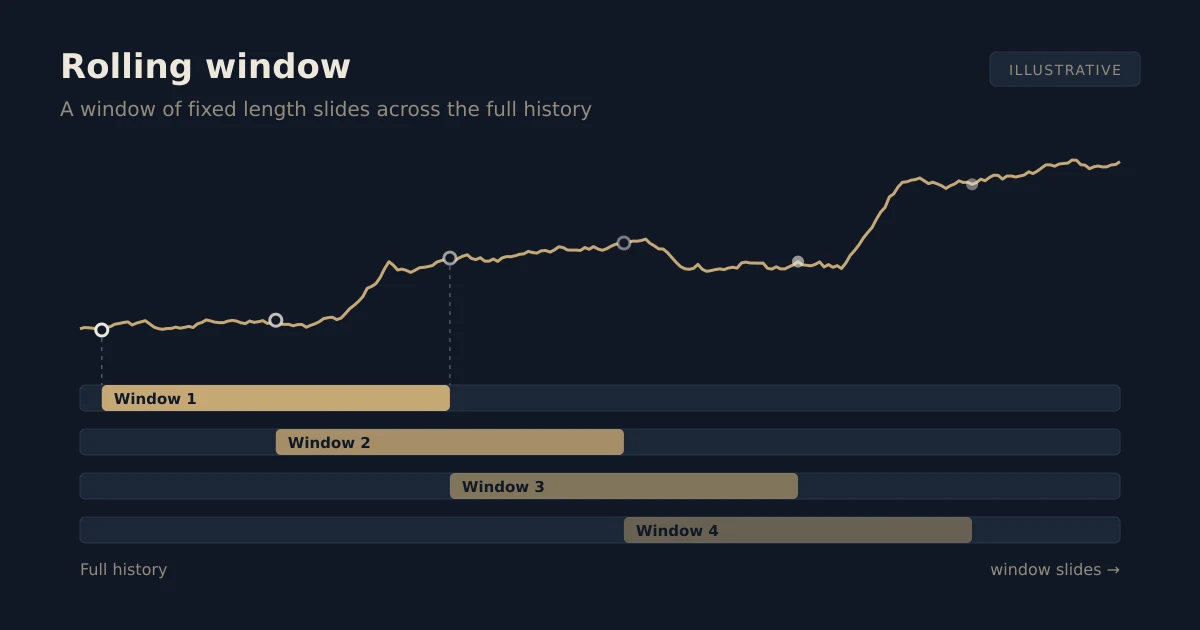
The windows overlap: if one 1-year window starts today, the window starting tomorrow contains almost the same days. The method does not cut history into chunks; it tries every possible “what if I had started on this date” scenario one by one.
A simple example
The numbers below are purely hypothetical and only illustrate the calculation. Say we placed a 3-month window at five different starting points:
| Starting point | 3-month return |
|---|---|
| A | +12% |
| B | +4% |
| C | −3% |
| D | +9% |
| E | +18% |
The panel would then show −3% as worst, +8% as average and +18% as best. In the real calculation there is one value for every day in the history, not five.
What do the columns in the panel mean?
In the analysis panel you first pick a Start trade and an End trade; every figure is computed within that range. Then you see:
| Column | What it shows |
|---|---|
| Window | The period length: 1 month, 3 months, 6 months, 1 year, 2 years. |
| Average | The average return across all windows of that length. |
| Worst | The return you would have had with the worst possible timing. The date range below it is that window. |
| Best | The return and date range of the best possible timing. |
| Period return | Total return from the start to the end of the selected range. |
| BTC, same period | The return of simply buying and holding BTC over the same range, for comparison. |
| Max drawdown | The largest peak-to-trough loss of the portfolio within the range, with its dates. |
| Winning trades | The share of trades closed in profit, plus the win / loss count. |
If the selected range is shorter than a window length, that row is dimmed: there is no window of that length to compute.
Why does the “Worst” column matter most?
The average tells you what usually happened. Worst answers “what if I had entered at the unluckiest moment?” That is usually the question to ask before starting any strategy: not what you hope for, but the limit you can live with.
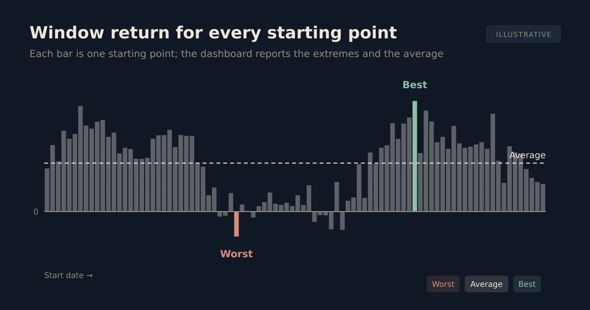
In the illustrative chart above, each bar is one starting point. The panel does not show the whole distribution, only its two ends and its average. If the worst value is positive, then for that window length the period ended in profit no matter which day in the past you started.
For ExecutorBTC, the panel’s worst value for windows of 1 year and longer has historically always been positive. That is an observation about past data; it does not mean it will remain so. Always check the current values in the panel.
How does window length change the result?
Short windows (1 month, 3 months) produce a wide spread: the gap between worst and best is large, because a few weeks depend on whether a single trend happened or not. As the window grows, good and bad stretches fall into the same window and offset each other, so timing matters less.
In practice this means that trying a trend-following strategy briefly and then stopping leaves the outcome largely to chance. Results over long windows reflect the overall character of the strategy better.
One caveat: because windows overlap, long windows contain few independent observations. A few years of history yields hundreds of 2-year window values, but most of them share the same days. Read long-window results as a strong indicator, not a hard rule.
Is max drawdown the same as the worst window?
No. They answer different questions:
- Worst window looks at the return at the end of a fixed period: “Where would I be after 1 year?”
- Max drawdown measures the largest loss along the way: “After a peak, how far did my account fall at most?”
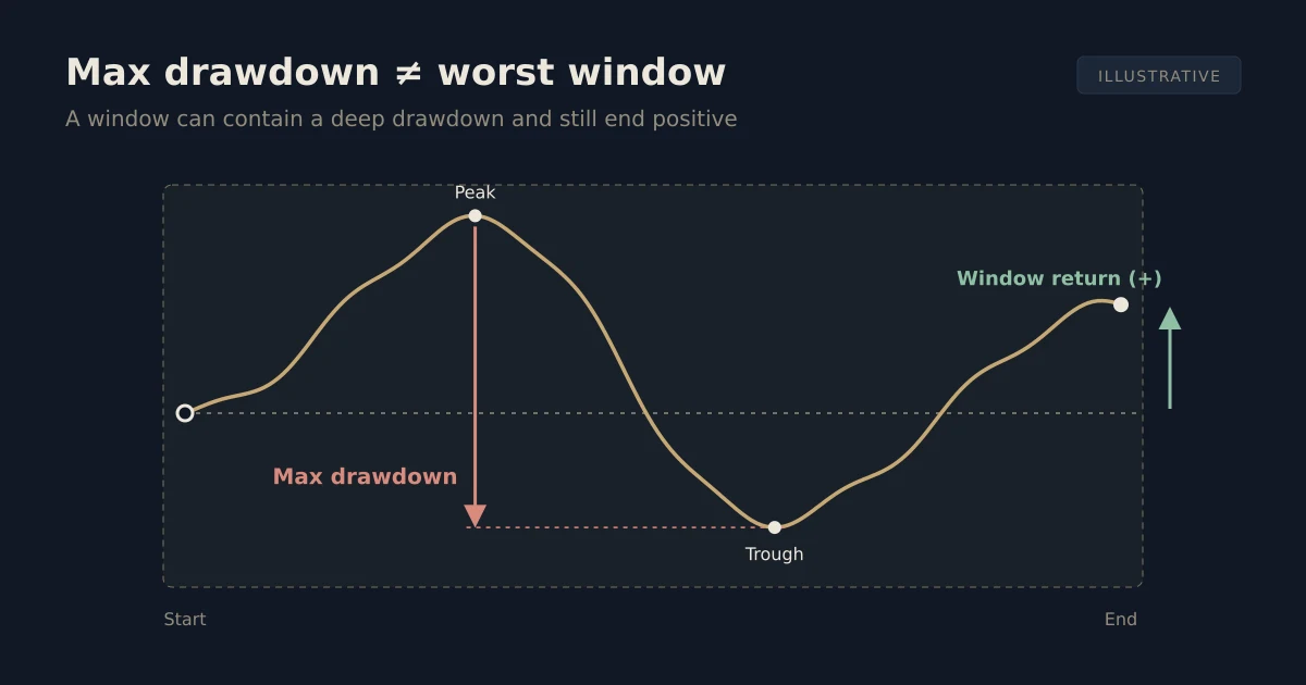
A window can contain a deep drawdown and still end positive. So look at both: the worst window shows the long-term outcome, while max drawdown shows the swings you must sit through to get there. Someone who cannot stomach the drawdown and exits halfway never sees the return at the end of the window.
How can you try it yourself?
- Go to the Deep analysis section on the home page.
- Pick the range you want to study from the Start trade and End trade menus.
- Read the Worst column and the dates under it, then check what happened in that period in the trade history.
- Compare Period return with BTC, same period.
- Select different market phases one at a time: years with sharp sell-offs, sideways stretches and strong rallies. Seeing how the strategy behaves in each environment tells you more than one total figure.
You can also review the long-term picture on the performance chart.
What are the limits of this analysis?
- The past does not guarantee the future. The analysis only covers market conditions that have already happened; an unseen environment can produce different results.
- The data mixes live and backtest results. ExecutorBTC has been in live use since 2025; the earlier period is a backtest. Backtests assume 100% capital usage, while live trading typically uses ~85% for an extra safety margin.
- Real costs can differ. Fees, funding and fill prices can deviate from the calculation.
- Windows overlap. Hundreds of window values do not mean hundreds of independent trials.
If you want to know how copy trading works and where your money stays, read what is copy trading.
Risks
No strategy is risk-free. ExecutorBTC trades BTC futures, typically with 2x leverage; leverage can amplify losses and short-term drawdowns happen. Positive historical results in a rolling-window analysis do not guarantee future returns. Only trade with capital you can afford to lose. See the risk disclosure for details.